Way Too Meteor
Link to Way-Too-Meteor Firebase App
Story
Last weekend, a buddy and I decided to go up to HackPrinceton and hack our way til Sunday. We didn’t care about the prizes, although we did take every possible piece of swag avaible. Instead, we simply practiced what we considered to be a necessary skill for us to work on, data visualization.
Data visualization has been creeping on me ever since I started working on my thesis, as it is a major skill and toolset for developers to not only understand their data, but learn how to manipulate it as well. Many data visualization techniques are also incredibly useful for data modeling and data preprocessing; two major examples comes from Christopher Olah, who visualized MNIST and other examples, both of which are spectacular posts. Because of this, I found it important to understand how to use these visualization tools for my benefit (also so I can make my own figures and copy Olah and distil’s superior posts).
We chose to focus on Three.JS, a 3D library that uses CSS3D and WebGL renderers, in order to work with Google’s WebGL Globe. With this globe, we mapped NASA Meteorite Landings, a dataset with over 45,000 meteorite landings including data such as mass, classification, and geo-location. In our project example we chose to focus only on mass and location.
Scaling Our Data
We couldn’t simply implement this data raw because:
- There were data vectors with missing mass or geo-location
- There were meteors with large mass outliers.
- Is it ever a good idea to implement data raw?
We instead preprocessed the data in order to remove any empty masses and geo-locations. This was very simply using Python:
# John Bucknam & Chris Pryer's HackPrinceton Fall 2016 Github Repository
# https://github.com/johnsbuck/hackprinceton-fall2016/blob/master/magnitude.py

i = 0
while i < len(X):
    try:
        float(X[i][4])  # Mass
        float(X[i][7])  # Latitude
        float(X[i][8])  # Longitude
        i = i + 1
    except ValueError:
        del X[i]
After removing any invalid data vectors, we then used Feature Scaling to simplify our mass to be ranged from 0 to 1, thereby allowing a bounded magnitude to represent each point when visualizing on our globe. In our case, we used the formula below:
\[x’ = \frac{x-X_{\text{min}}}{X_{\text{max}}-X_{\text{min}}}\]
Where \(x \in X\). However, feature scaling alone can still leave problems.
Fixing the Skew
Below is the original mass after being scaled and sorted in ascending order.

That isn’t good.
We could simply toss out those outliers, but I believe those outliers are the most interesting part of the data. That shows the huge impacts that were made by meteorites onto the Earth, colliding with such massive force as it broke apart within our atmosphere and pierced the ground that we stand on! Because of this we chose to keep them in, but how would we represent our data with such skewed data? We couldn’t use this data directly since it would have most of our data points be smaller and weaker in magnitude. We needed to modify our data in some way that would give more value to our smaller, but more abundant, data points. For something this skewed, my first thought was modifying each point by using the log function. Once again, by using Python our problem it was a cinch:
# John Bucknam & Chris Pryer's HackPrinceton Fall 2016 Github Repository
# https://github.com/johnsbuck/hackprinceton-fall2016/blob/master/magnitude.py

import numpy as np

def feature_scale(nparray):
    return (nparray - np.amin(nparray))/(np.amax(nparray) - np.amin(nparray))

X = np.asarray(X)

mass = X[1:,4].astype(np.float)
new_mass = np.log(np.log(np.sort(mass)+1)+1) # Added ones to prevent negative values
new_mass = (new_mass - np.amin(new_mass))/(np.amax(new_mass) - np.amin(new_mass))

indices = feature_scale(np.arange(mass.shape[0]).astype(float))

plt.plot(new_mass, color="red")
plt.plot(indices, color="blue")
plt.plot(feature_scale(np.log(np.sort(mass).astype(float) + 1)), color="purple") # Added one to prevent negative values
plt.plot(feature_scale(np.sort(mass).astype(float)), color='green')

plt.ylabel('Mass')
plt.xlabel('Index')
plt.show()
After some experimentation, we received the following graph, with the following plotted lines:
- Green: orig_mass (Original Mass)
- Purple: ln(orig_mass)
- Red: ln(ln(orig_mass))
- Blue: A straight line (y=x)

After looking at these and other figures, we chose the purple line (the natural log of the original mass) as it was the closest to our original mass compared to the other two lines, but also gave each point a stronger value. By doing this, we were able to output our values into a json file and implement them with the globe.
The Globe
Using the Chrome Experiment example page as reference, we implemented the WebGL Globe using our output.json. We further modified the globe.js in order to give more visual information for each point.
// John Bucknam & Chris Pryer's HackPrinceton Fall 2016 Github Repository
// https://github.com/johnsbuck/hackprinceton-fall2016/blob/master/public/globe.js

// Scaled the size of the point
function addPoint(lat, lng, size, color, subgeo) {
  ...
  point.scale.x = Math.max( size, 0.1 ); // avoid non-invertible matrix
  point.scale.y = Math.max( size, 0.1 ); // avoid non-invertible matrix
  ...
}

// Changed the colors
DAT.Globe = function(container, opts) {
  opts = opts || {};

  var colorFn = opts.colorFn || function(x) {
    var c = new THREE.Color();
    c.setHSL( x, 0.5, 0.5 );        // Adjustment made here
    return c;
  };
  ...
}
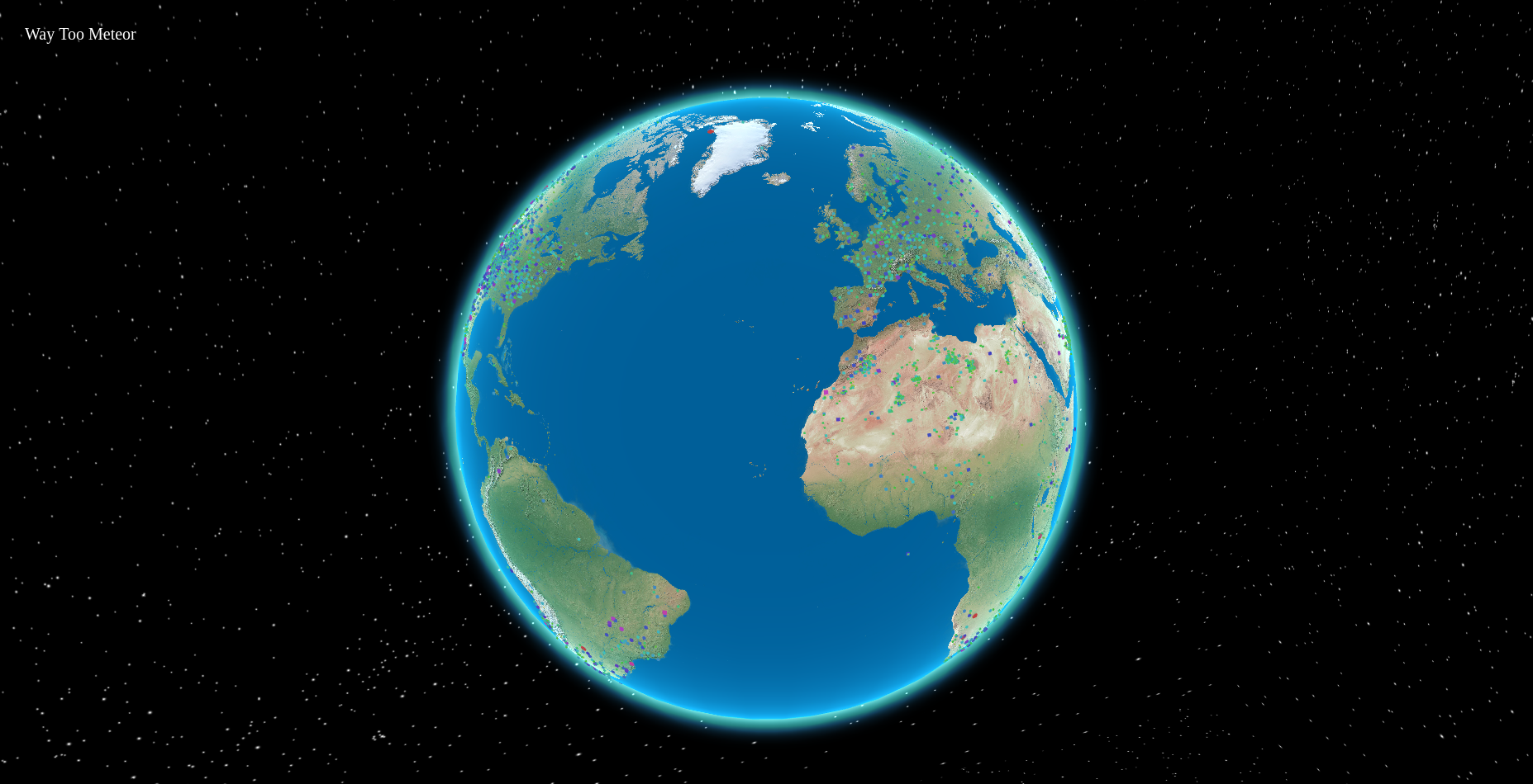
From those small changes we were able to produce these points:
As you can see from the image below, each point has a corresponding size and color. The magnitude of each data vector inserted represent the area and color of their own distinct point. As of this post, our gradient goes from yellow (low mass) to green & blue (mid-mass) to red (high mass).

Details
Some minor details that were also made was the Earth image used by the globe. My partner, Chris Pryer, was incredibly adamant on finding a good image for our globe and stars, and sure enough he was able to do both.
The stars were more difficult, as we were required to create a skybox which can be seen in the given code below:
// John Bucknam & Chris Pryer's HackPrinceton Fall 2016 Github Repository
// https://github.com/johnsbuck/hackprinceton-fall2016/blob/master/public/globe.js

function init() {
  ...
  var backgroundMesh = new THREE.Mesh(new THREE.BoxGeometry(10000, 10000, 10000), new THREE.MeshBasicMaterial({

    map: texture,

    side: THREE.DoubleSide

  }));

  scene.add(backgroundMesh);
  ...
}
Future Changes
There are some issues that we would like to fix, such as how points are overlapping each other. We would instead like to create regions or use some type of clustering algorithm that would better show our meteorite data in a more, presentable fashion. We would also like to make the points into circles instead of squares as they are now.
We’d also like to add some major features, including referencing these meteorites to other web data by clicking on the individual point and populating the data using some Google Search API or Amazon’s Common Crawl. We’d also like to have ba sic data, such as mass and geo-location, visible when hovering over individual points.
Conclusion
Overall, the project was very entertaining and gave us an interesting look into not only basic data visualization, but 3D graphics development as well using the globe.js graphics engine. We are planning on doing more with Way Too Meteor in the future, and I’m sure to add another post when on those changes I get the chance.
For now, here is the link to the live web site if you want to view it yourself:
Link: Way Too Meteor Firebase App
I would like to thank Princeton and the people who ran HackPrinceton for giving us the time, space, and food while we were able to work on our personal projects.